Challenge
A growing library of courses, webinars, and rewards left learners unsure where to start or what to do next.
Tradimo – an online course platform for brokers
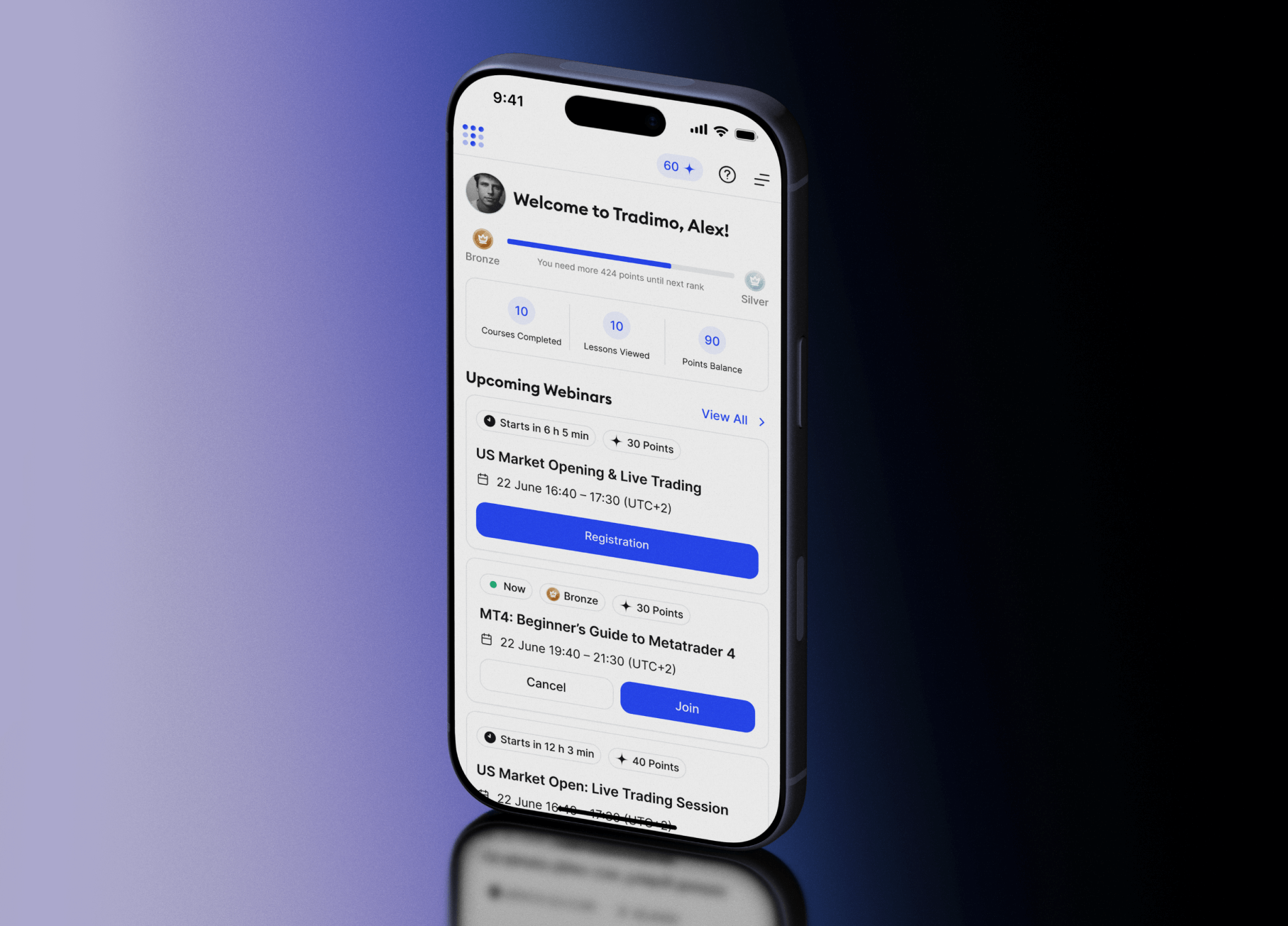
As the sole Product Designer alongside five developers, I made learning easier to start, continue, and explore.
A growing library of courses, webinars, and rewards left learners unsure where to start or what to do next.
I led research, problem definition, prototyping, testing, and implementation support.
I focused on three learner needs:
Usability tests showed 30% faster average task completion across selected core journeys.
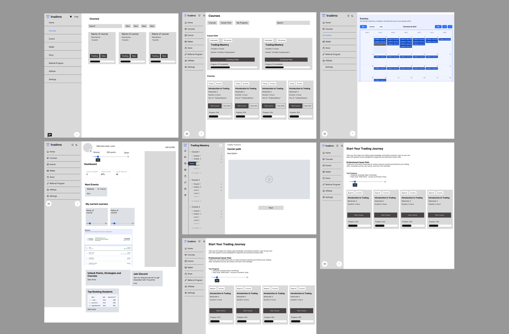
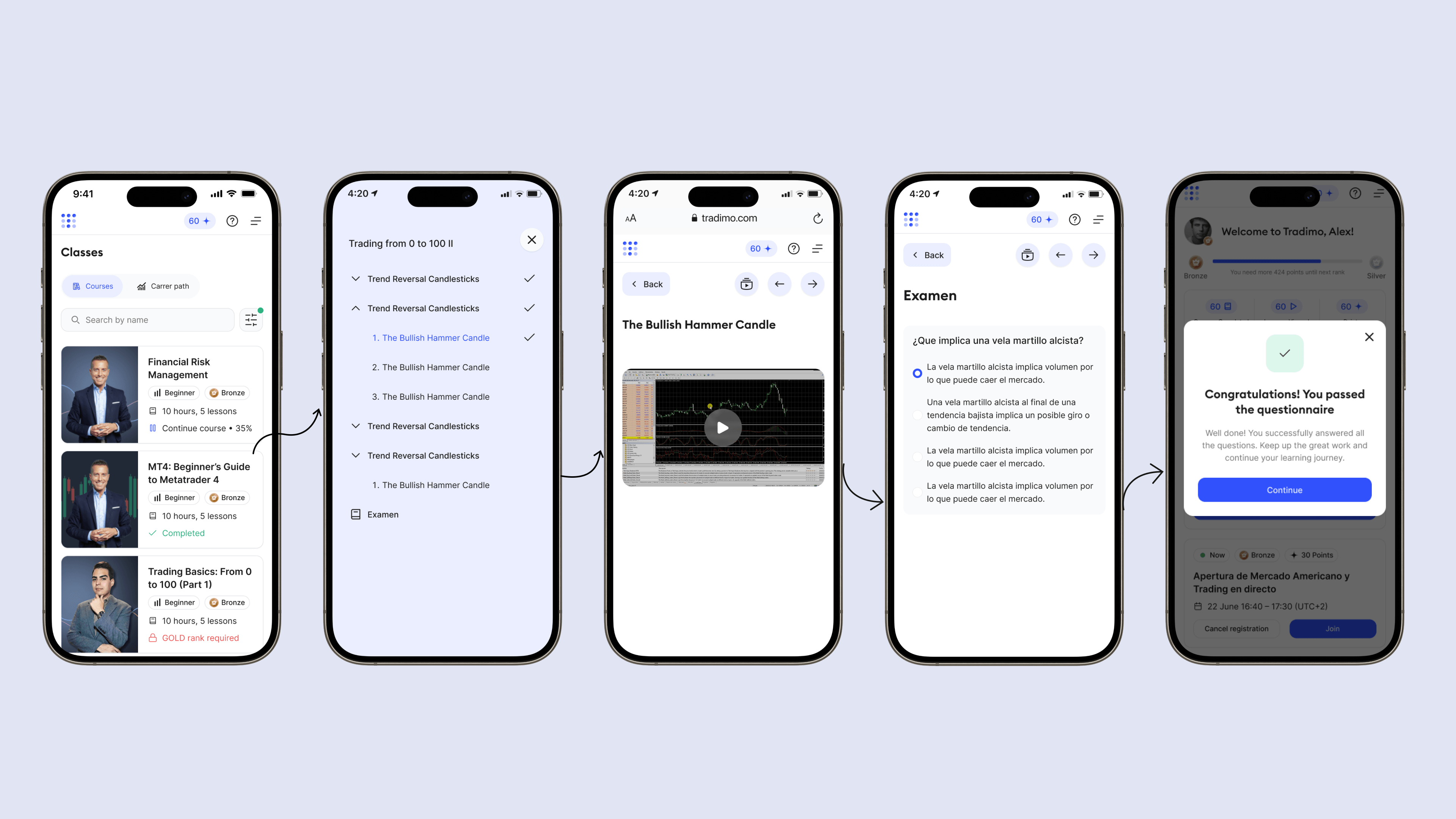
More content meant more decisions. Learners struggled to start, resume courses, and find content for their level. The opportunity was to clarify the existing experience.
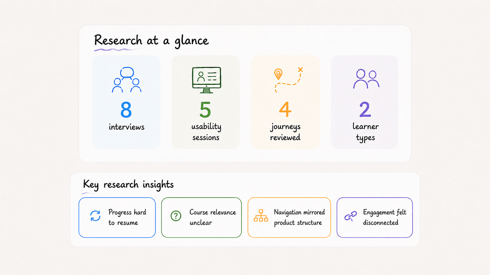
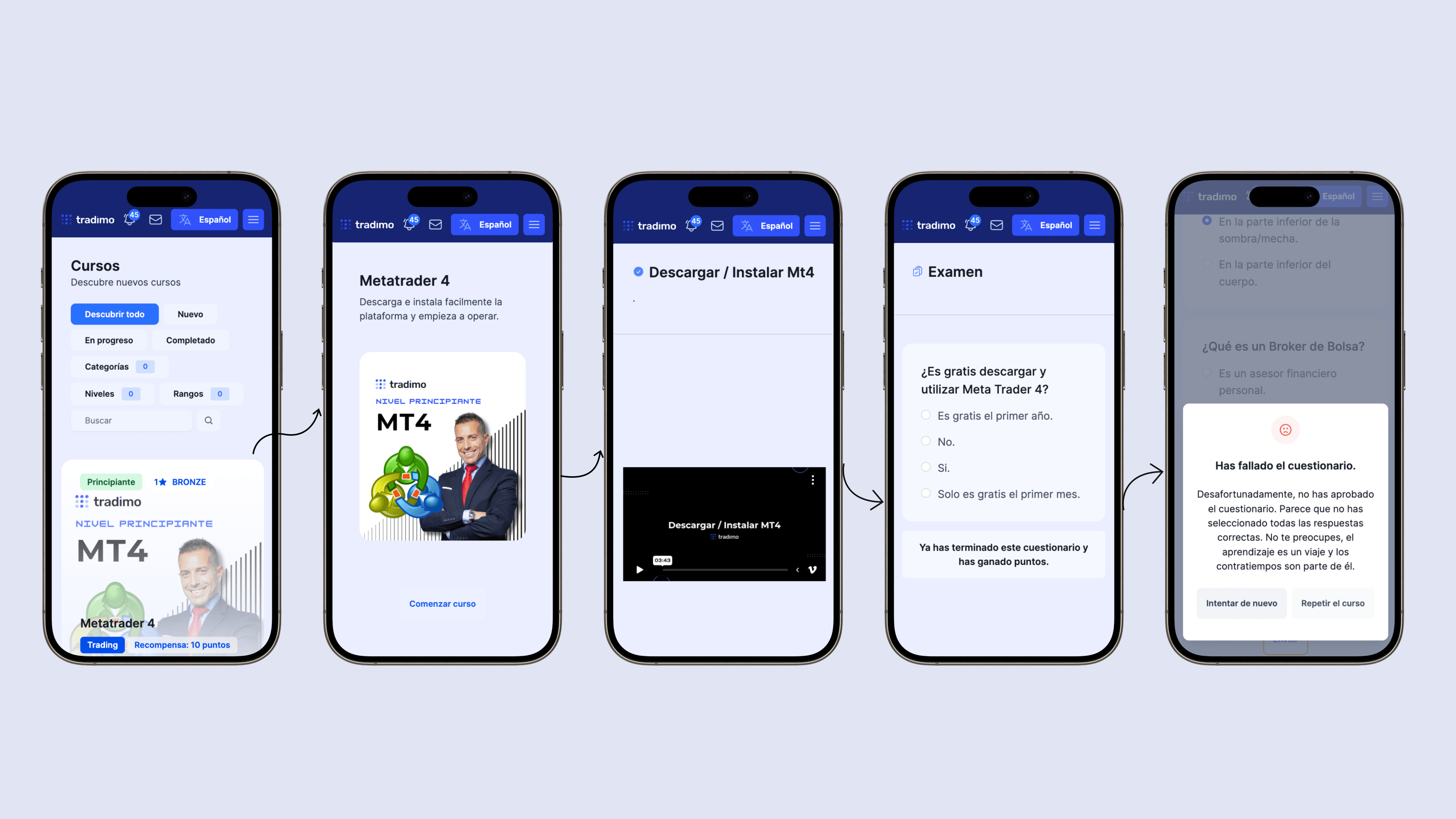
Interviews, usability tests, journey mapping, and a UI audit revealed friction in:
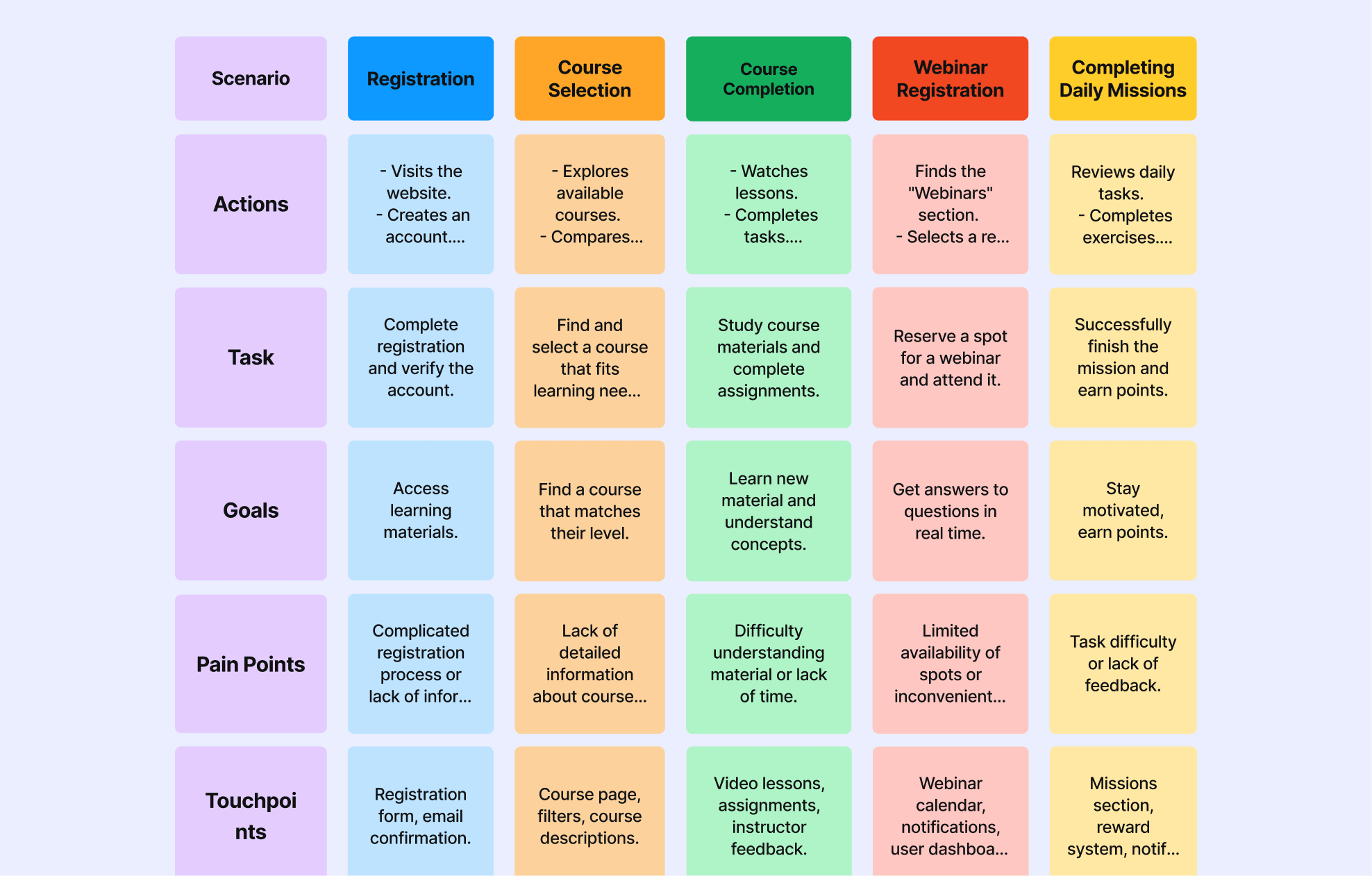
Journey mapping connected a confusing home screen to activation, weak course information to discovery, and disconnected webinars and rewards to engagement.
Three priorities:
Beginners needed guidance; returning learners needed speed. One path could not serve both.
I prioritized three improvements:
Start or resume learning faster.
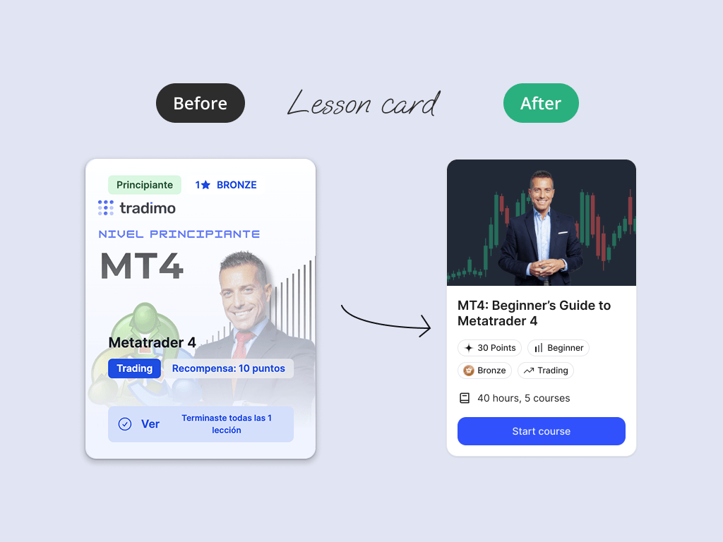
Find and evaluate relevant content.
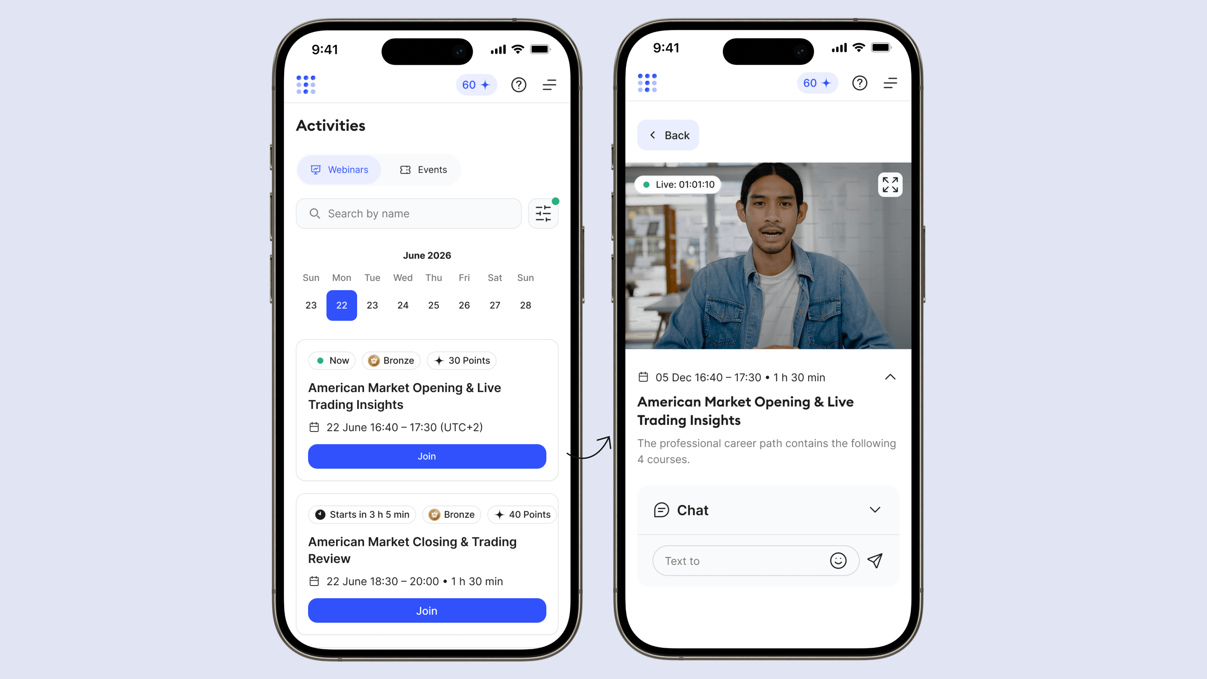
Connect webinars and rewards to progress.
I tested different ways to organize the experience around learner state and progress. The chosen direction guides beginners toward a first lesson while giving returning learners fast access to unfinished content, without forcing both groups through the same path.
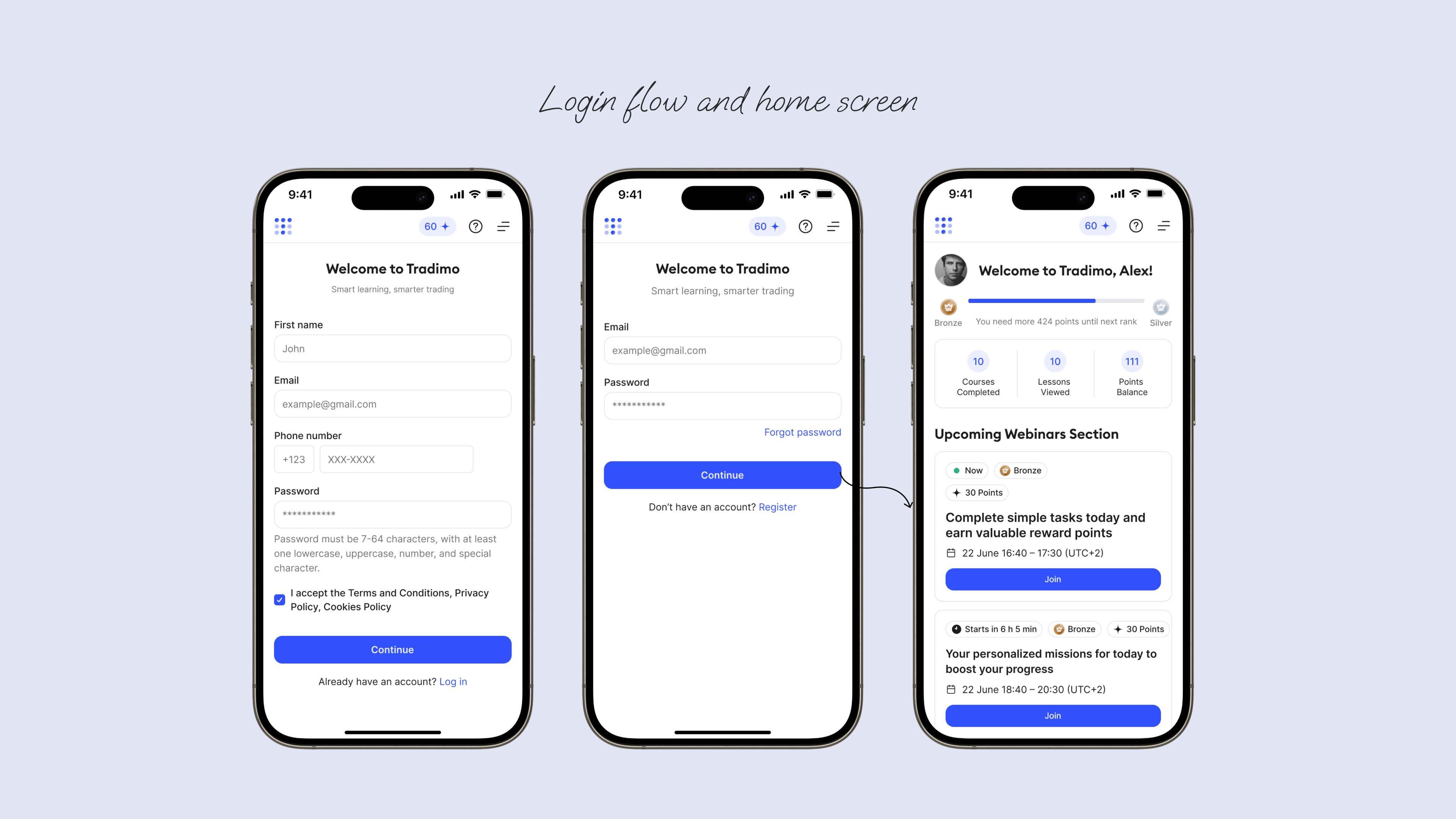
Analytics showed drop-off before the first lesson. I simplified login and highlighted the next learning action on entry.
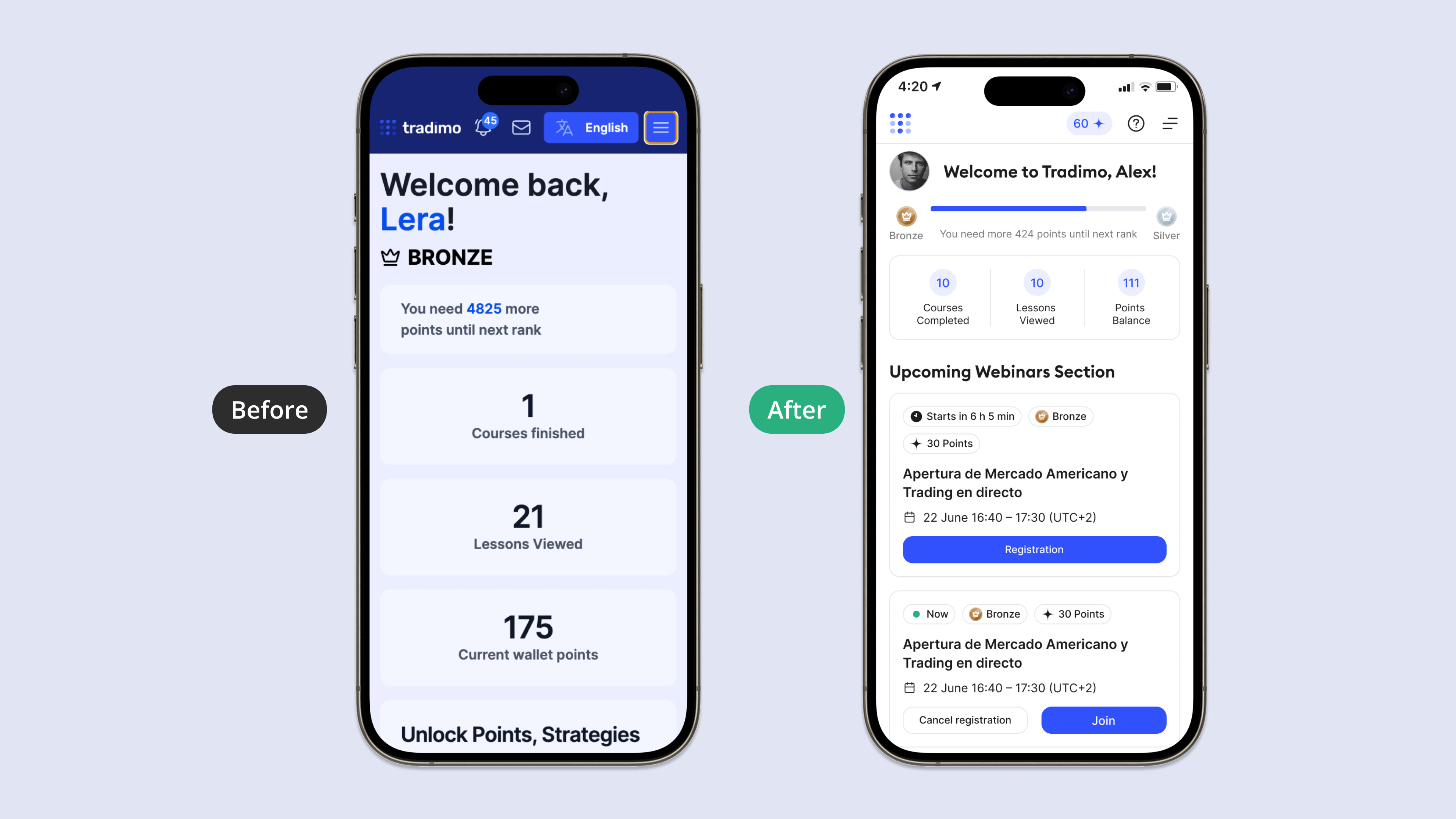
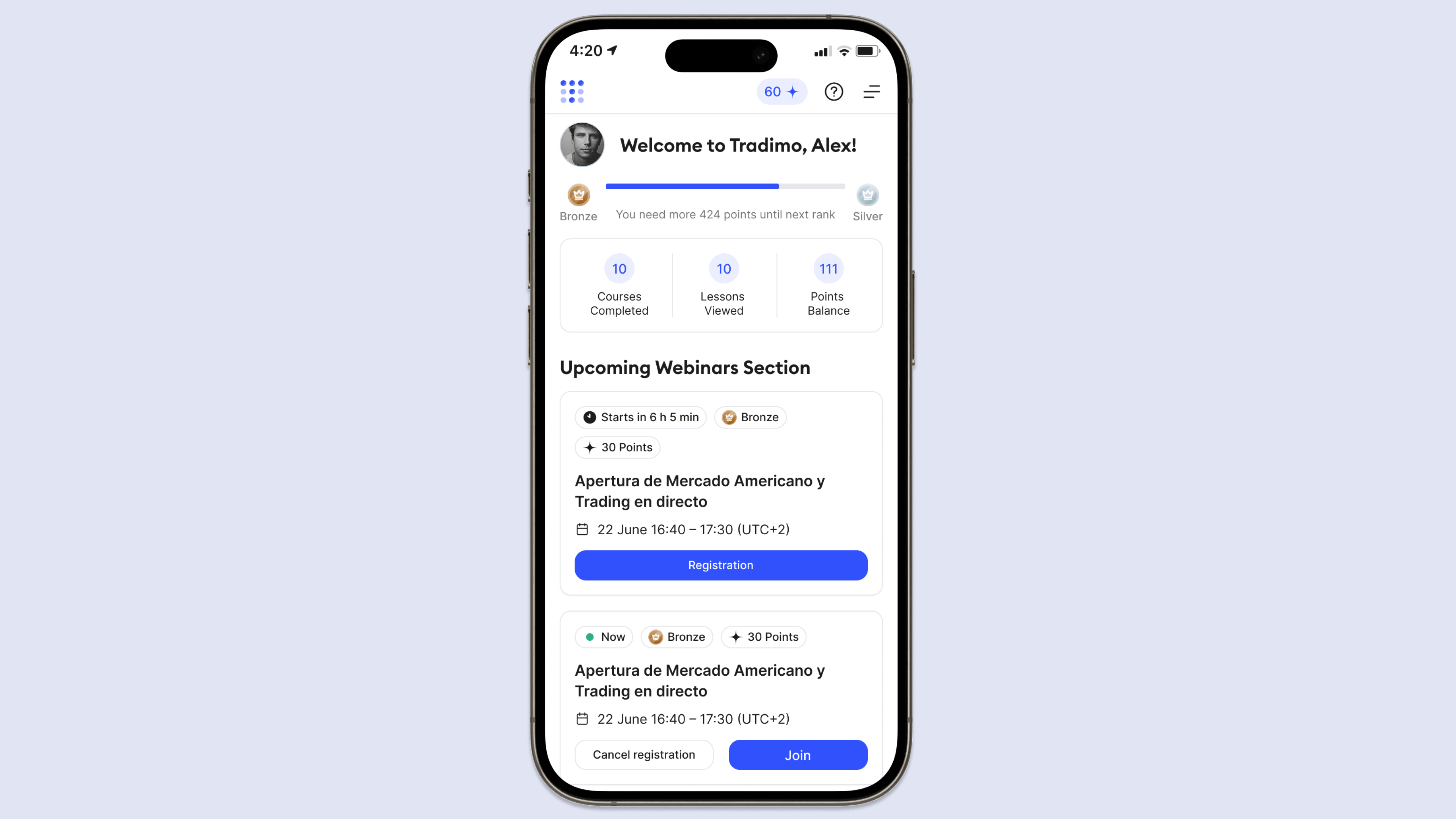
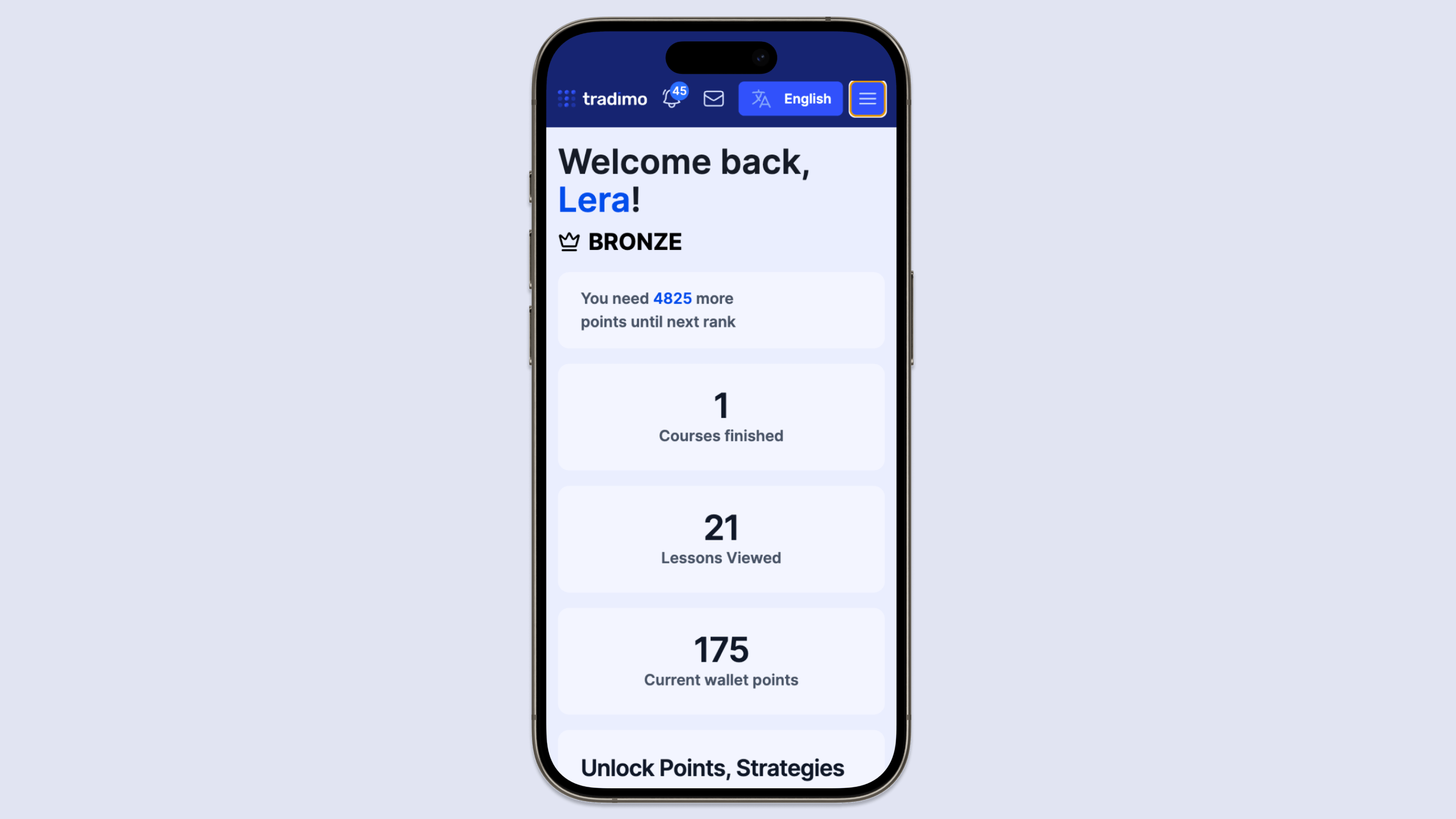
The dashboard and navigation needed to show learners:
I removed repeated navigation paths and surfaced progress and unfinished learning.
Course cards lacked decision-making details. I brought four essentials forward:
I connected upcoming webinars and recordings in one flow: discover, join, set a reminder, and return to watch.
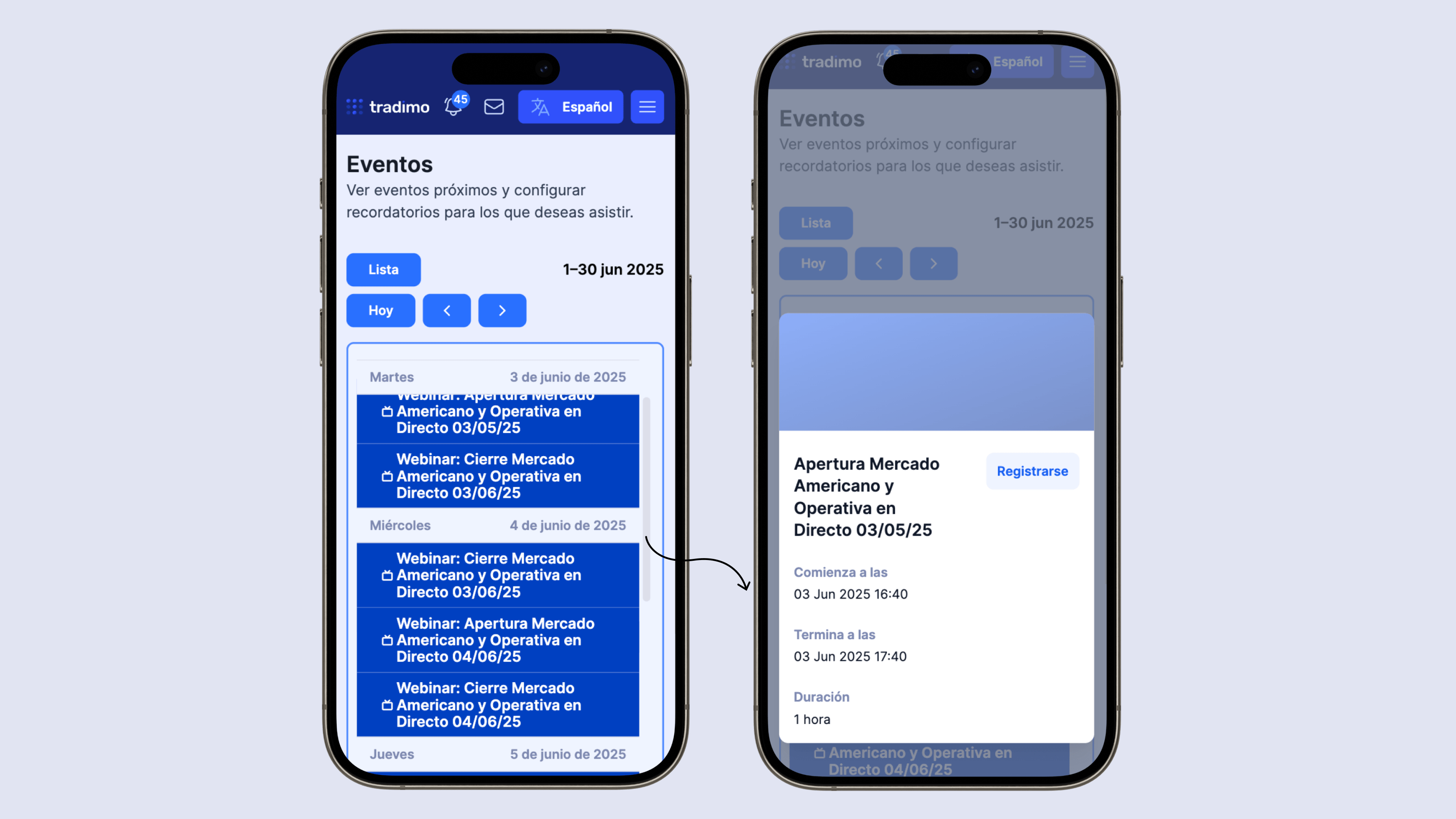
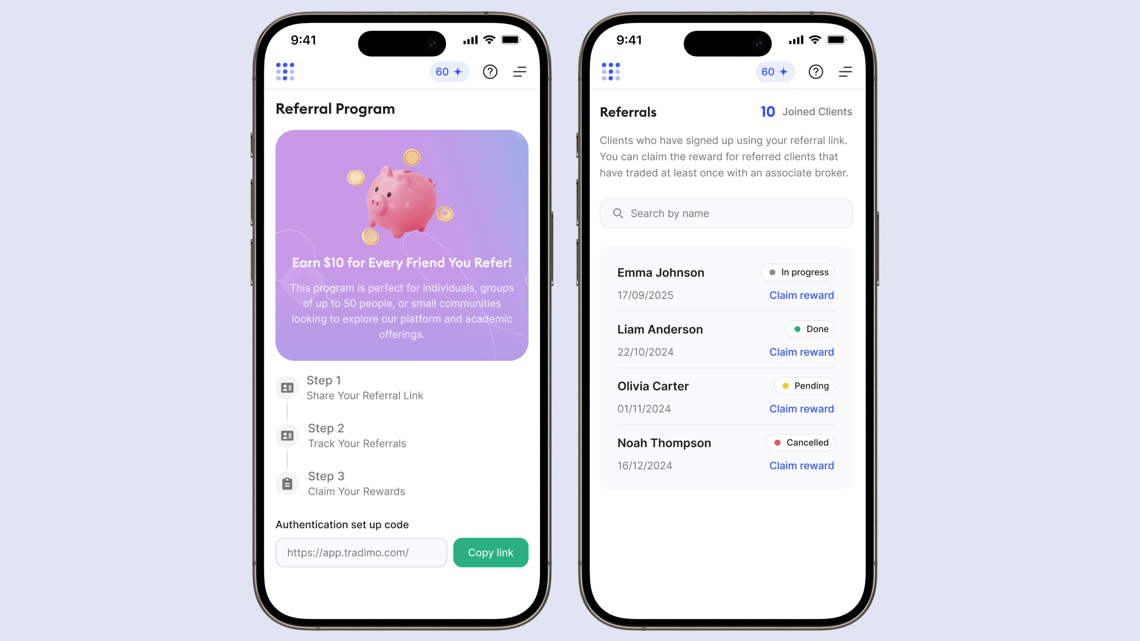
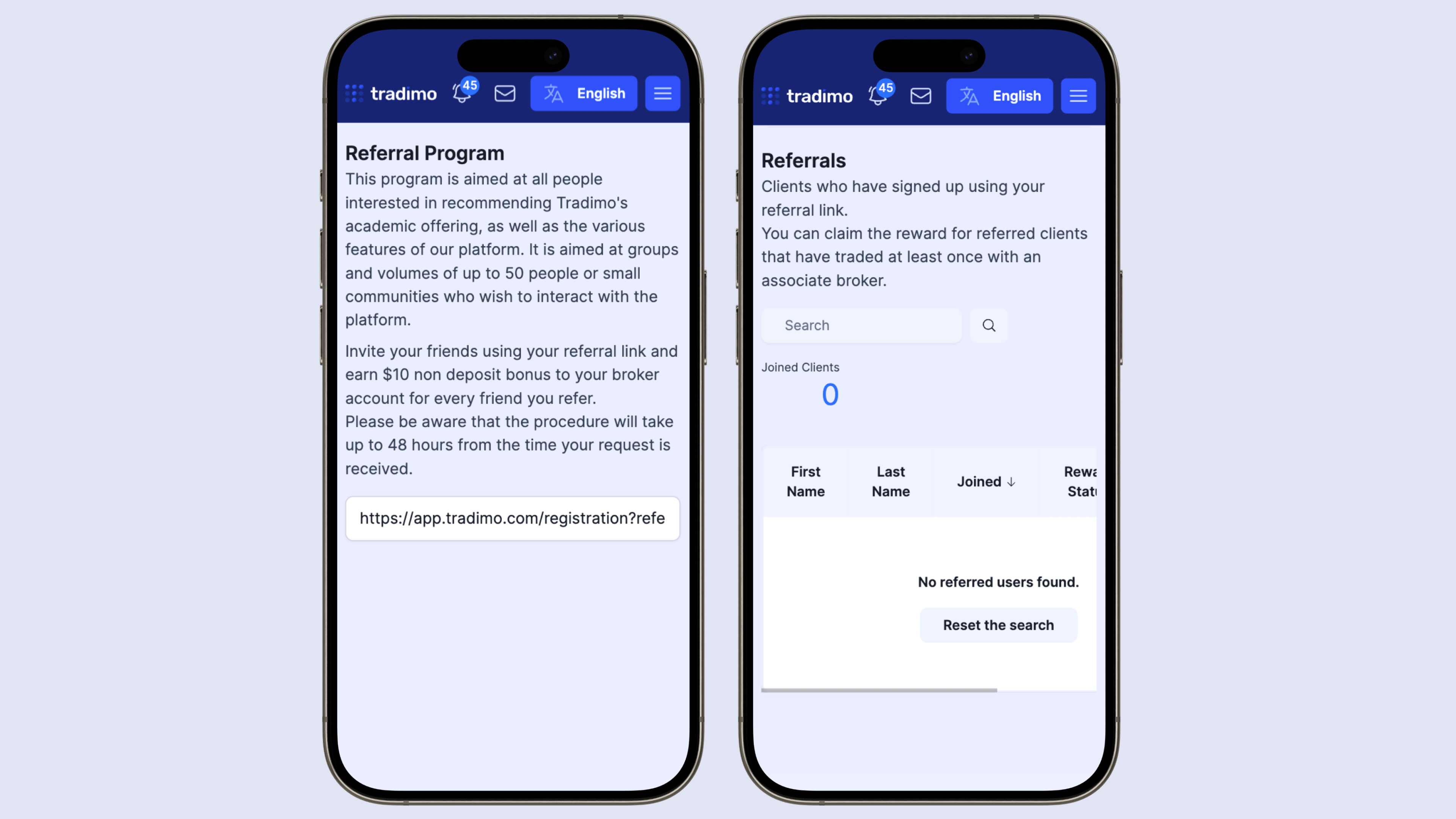
I tied coins and referrals to progress and completion, rather than displaying rewards everywhere.
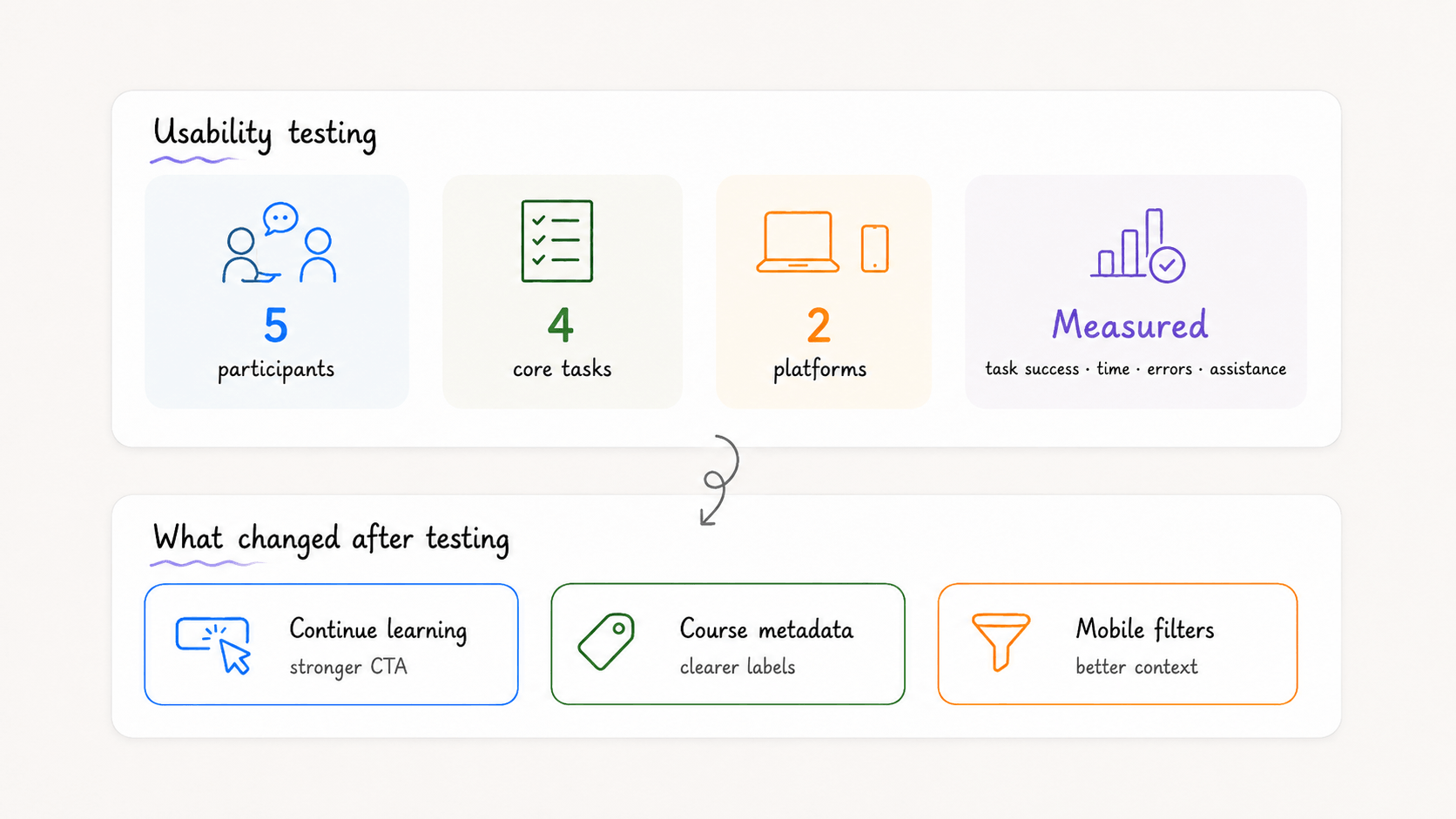
I tested desktop and mobile journeys, measuring task success, completion time, navigation errors, and where learners needed help. The findings guided changes to CTA visibility, course information, and mobile filters before the final design.
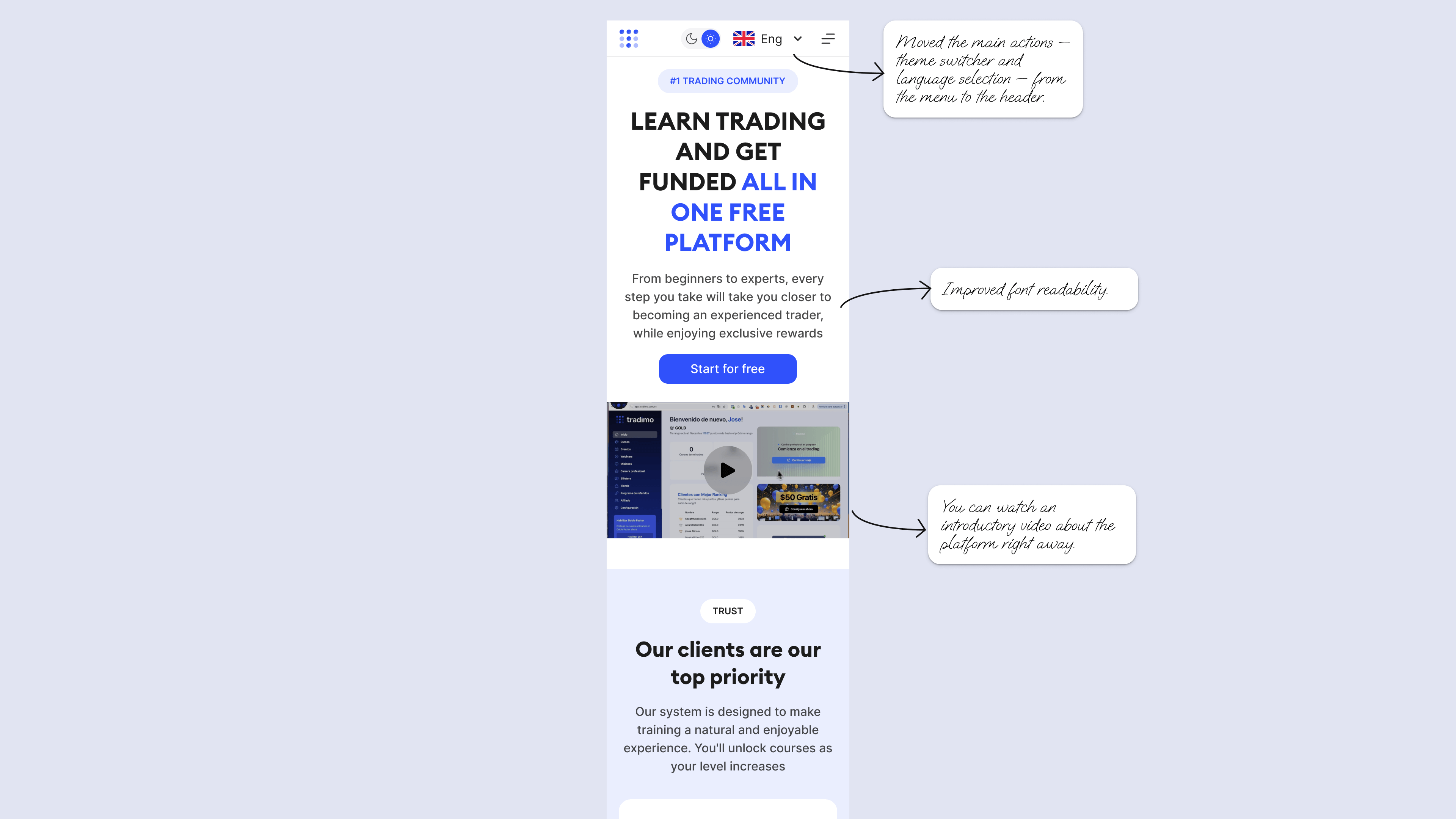
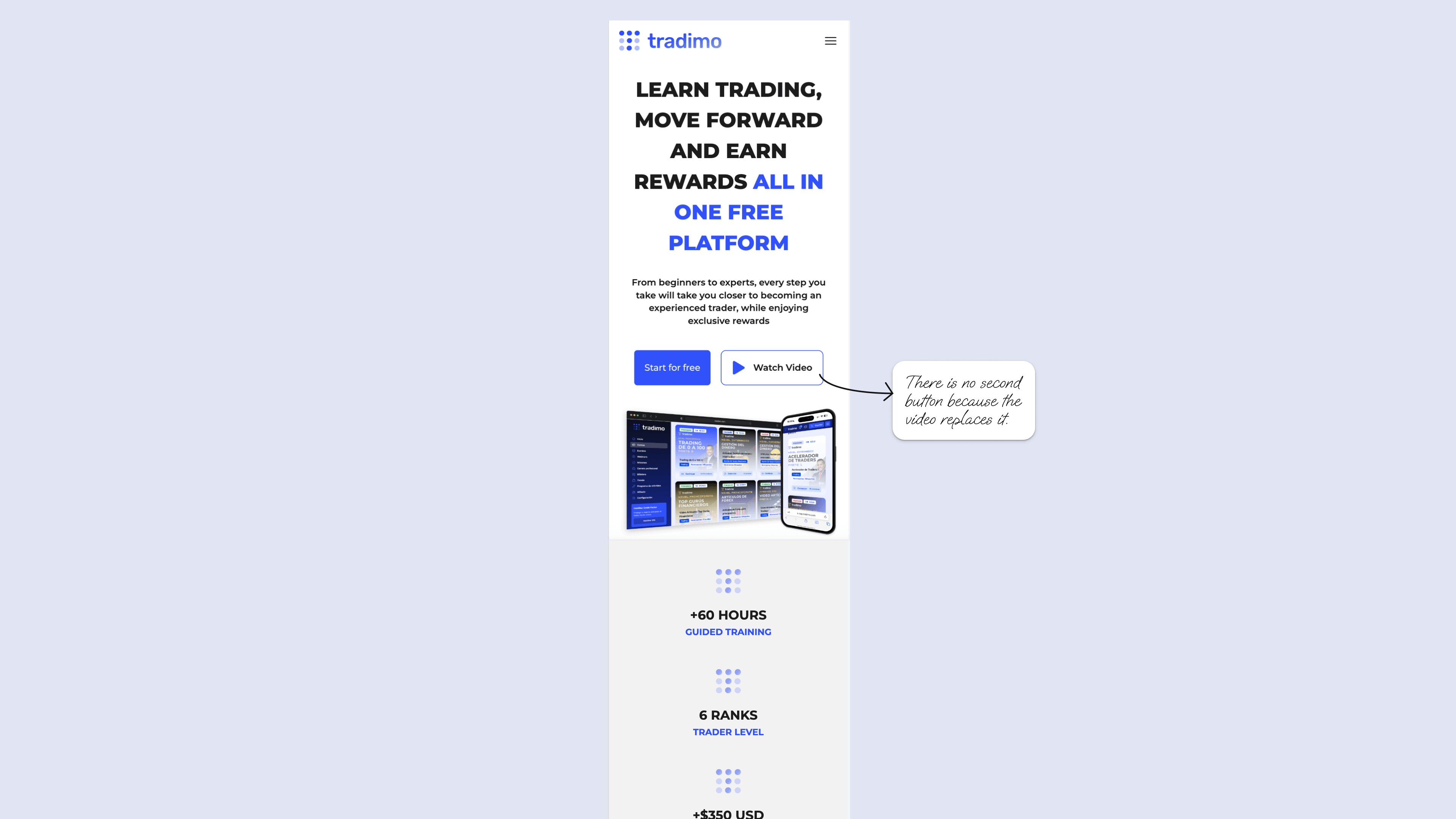
For the broker education landing page, I clarified the hero and CTA, improved readability, and moved key controls upward.
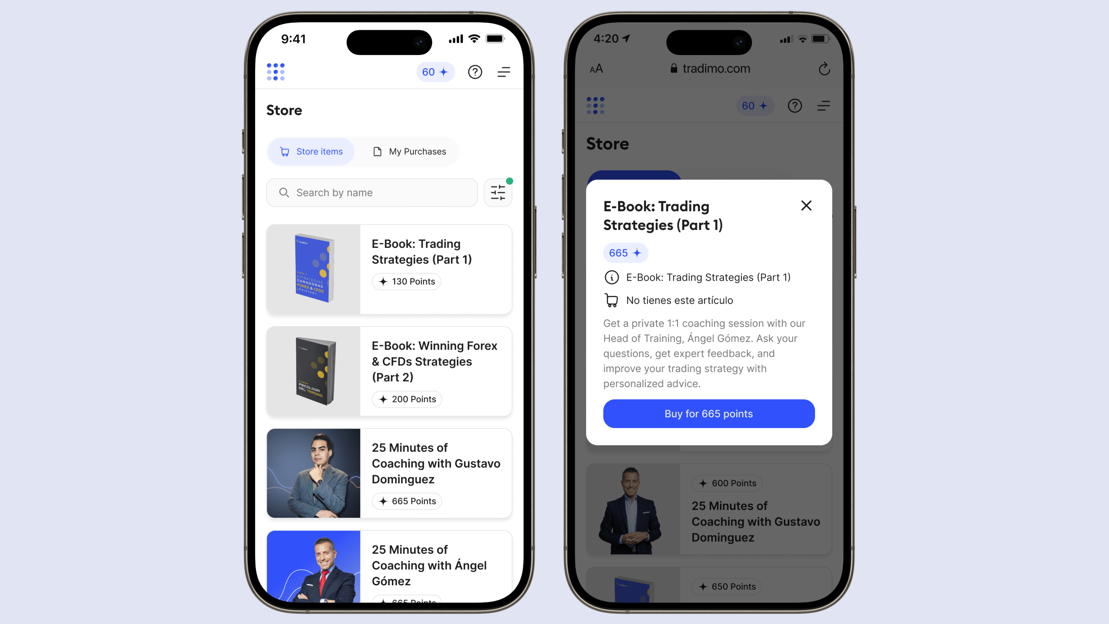
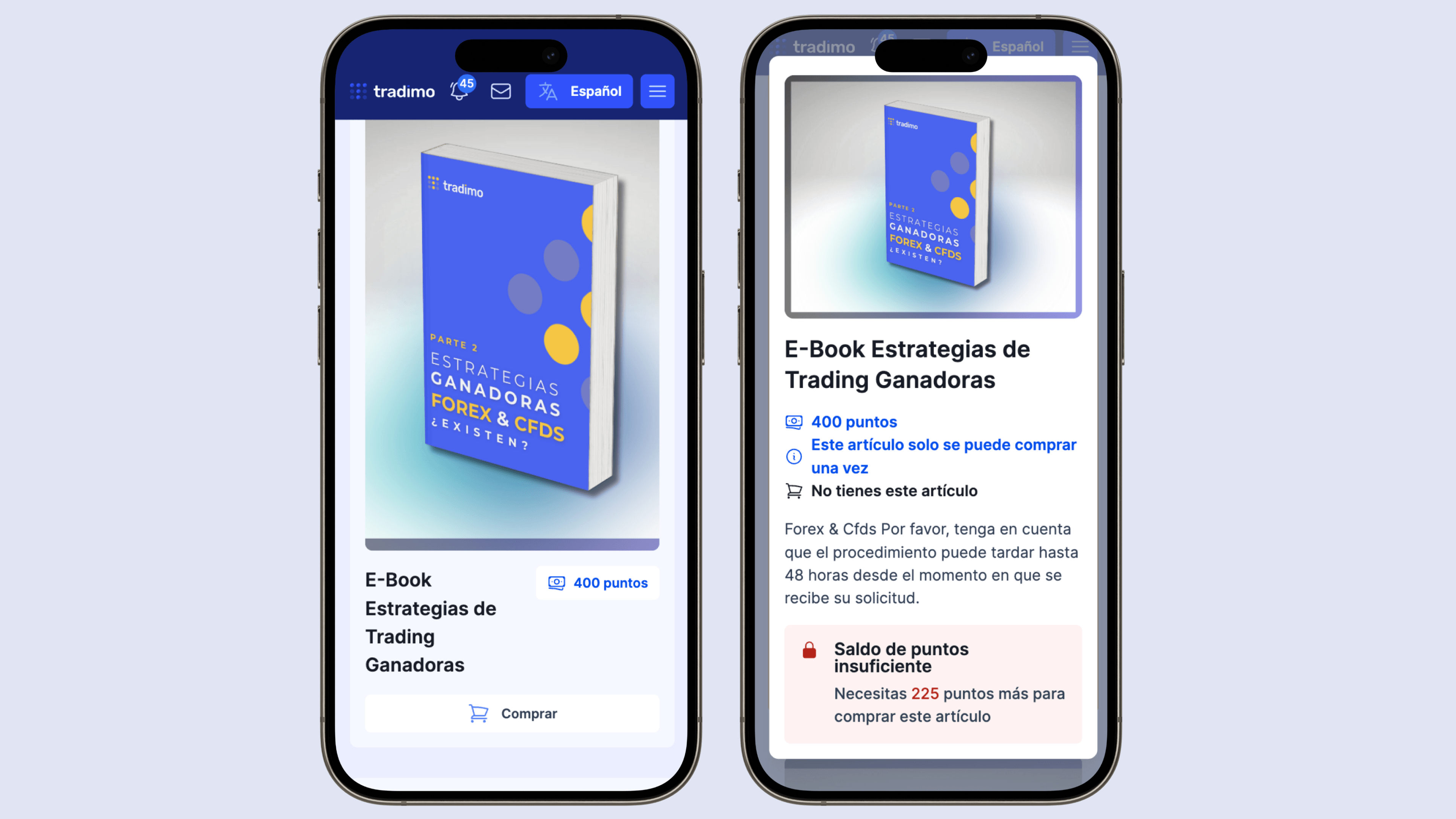
The old purchase journey spanned several pages. I replaced it with a searchable catalog and quick product view that brings together details, point price, status, and a clear Buy action. This shortened the path to purchase, especially on mobile.
The biggest improvement did not come from adding more features.
Three questions guided the redesign:
Usability testing: 30% faster average completion across selected core journeys.
Consistent patterns reduced friction across courses, webinars, rewards, and purchases.
Valeriia Bulgakova · © 2026